Philip Seifi 飛駿, my personal seal

Nomad entrepreneur cross-pollinating between industries and cultures — and going a little too deep in each.

2026

An ivory paper spreadsheet grid with burgundy cellsColabraCo-founder. AI for acquisition due diligence.Pick up to explore. Drag with a mouse or use left and right arrow keys. Press Enter toread.
An ivory paper spreadsheet grid with burgundy cells

Colabra

Co-founder. AI for acquisition due diligence.

Linglong 玲瓏

Tea. Craft. One more game.

Linglong

Linglong · Gameplay trailer

0:00

Watch original film

It began with tea.

I have spent much of my life in the Chinese-speaking world: home in Hong Kong, Malaysia and Taiwan, seasons in mainland China and Singapore. Tea was always on the table. In time I followed it to the source, spending whole afternoons with farmers in the hills of Wuyishan. Then I went to see who made the cups.

In Yixing, I watched apprentices work beside their masters and press their seals into the clay. In Jingdezhen, I saw imperial porcelain rejected by the court: smashed, buried, and pieced together centuries later. In Taipei, I lingered over an emperor’s curio box, no bigger than a book, with a small treasure of every craft inside.

Those encounters became the world of Linglong. Five crafts, each with its own character. Long, narrow cards like the ones the old uncles play in the park. A digital table with weight, texture and sound, where petals settle and rain darkens the cloth.

A friend and I never travel without a board. Some games are played to win; ours is played to keep playing. Over the years we changed so many rules that we needed a game of our own. So I made one, for the pleasure of sitting across from someone you know well, and still being surprised by their next move.

Signed, Philip SeifiSeal: 飛駿

Philip Seifi
Designer, Backstamp Games

A small ivory seal bearing Backstamp’s red markBackstamp GamesMy game studio, inspired by craft and culture.Pick up to explore. Drag with a mouse or use left and right arrow keys. Press Enter toread.
A small ivory seal bearing Backstamp’s red mark

Backstamp Games

My game studio, inspired by craft and culture.

A glazed ring bearing letters from different languagesElsewordA multilingual dictionary I designed and built.Pick up to explore. Drag with a mouse or use left and right arrow keys. Press Enter toread.
A glazed ring bearing letters from different languages

Elseword

A multilingual dictionary I designed and built.

A miniature rubber running track in green, purple, and redZonometryApple Health, turned into a playful training tool.Pull the track to move the runner. Drag with a mouse or use left and right arrow keys. Press Enter toread.
A miniature rubber running track in green, purple, and red

Zonometry

Apple Health, turned into a playful training tool.

Zonometry balance screen on a sunny day

Zonometry

I designed and built an iPhone app that turns Apple Health workouts into a clear view of training intensity.

Explore ZonometryGet the app
遊蜂見蜜停在花上我本漂泊見落日竟駐足啜花香茗漸近蜂心

2025

2022

A paper print of my deer and lotus pond illustrationReflections of GyeongjuPlaces I’ve travelled, translated into illustration.Pick up to explore. Drag with a mouse or use left and right arrow keys. Press Enter toenlarge the artwork.
A paper print of my deer and lotus pond illustration

Reflections of Gyeongju

Places I’ve travelled, translated into illustration.

Deer and lotus pond illustration

Reflections of Gyeongju

Places I’ve travelled, translated into illustration.

A blue cassette labelled Talking BiotechTalking BiotechPodcast production with scientist Kevin Folta.Pick up to explore. Drag with a mouse or use left and right arrow keys. Press Enter toread.
A blue cassette labelled Talking Biotech

Talking Biotech

Podcast production with scientist Kevin Folta.

2021

The red and silver rocket awarded to Colabra at Take Off IstanbulTake Off, IstanbulColabra won first place at the 2021 startup summit.Pick up to explore. Drag with a mouse or use left and right arrow keys. Press Enter toread.
The red and silver rocket awarded to Colabra at Take Off Istanbul

Take Off, Istanbul

Colabra won first place at the 2021 startup summit.

2020

A red Colabra research notebook with graph paper, index tabs and a pencilColabra for R&DFrom a two-week MVP to the Yamanaka Lab.Pick up to explore. Drag with a mouse or use left and right arrow keys. Press Enter toread.
A red Colabra research notebook with graph paper, index tabs and a pencil

Colabra for R&D

From a two-week MVP to the Yamanaka Lab.

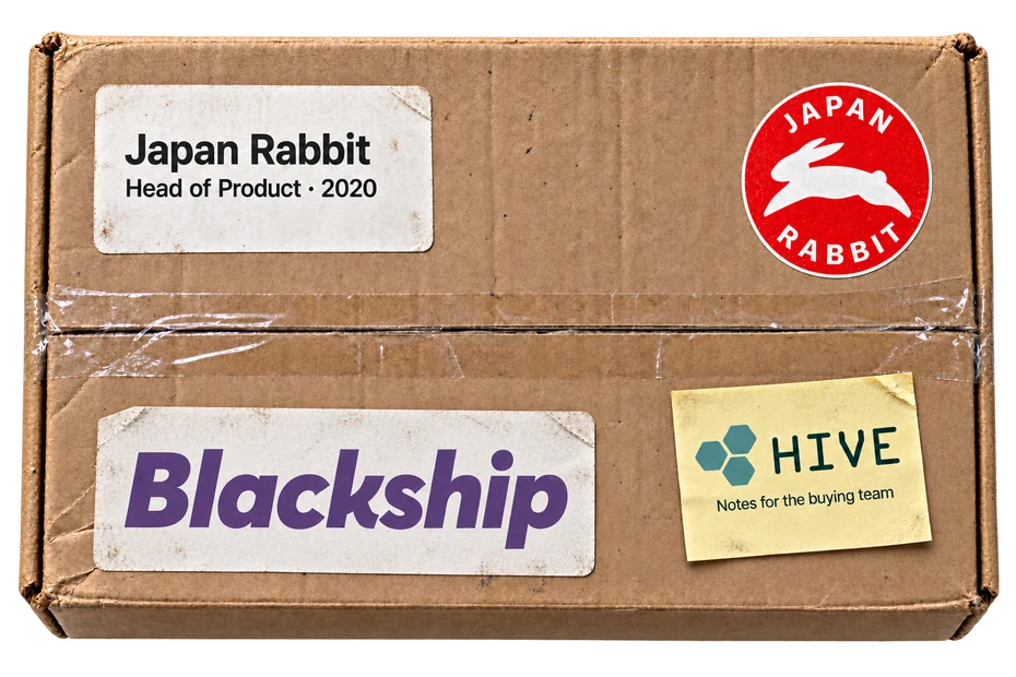
A brown parcel with Japan Rabbit, Blackship and Hive Notes labelsJapan Rabbit & BlackshipHead of Product · Purchasing automation and tools for the buying team.Pick up to explore. Drag with a mouse or use left and right arrow keys. Press Enter toenlarge the artwork.
A brown parcel with Japan Rabbit, Blackship and Hive Notes labels

Japan Rabbit & Blackship

Head of Product · Purchasing automation and tools for the buying team.

Japan Rabbit, page 1
Original Data Analyst Nanodegree certificate, awarded January 18, 2016Data scienceThree nanodegrees, applied to real product decisions.Pick up to explore. Drag with a mouse or use left and right arrow keys. Press Enter toenlarge the artwork.
Original Data Analyst Nanodegree certificate, awarded January 18, 2016

Data science

Three nanodegrees, applied to real product decisions.

Original Udacity Data Analyst certificate

Data Analyst

Data analysis with Python and statistics. Udacity Nanodegree.

My four-colour clustering plots for Starbucks customer behaviourWho takes the offer?Four customer segments, found with Python.Pick up to explore. Drag with a mouse or use left and right arrow keys. Press Enter toread.
My four-colour clustering plots for Starbucks customer behaviour

Who takes the offer?

Four customer segments, found with Python.

Four kinds of customer

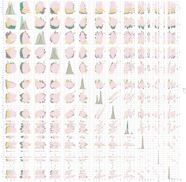
Original K-means pair plot: four customer clusters, shown in green, brown, gold and pink across twelve principal components
Four customer segments, seen across twelve principal components.

Starbucks customer segmentation

For my Udacity capstone, I grouped customers by their purchasing habits and responses to promotions, using a month of simulated Starbucks transactions.

First, understand the customers

Pair plots comparing age, income and membership year

Choose the number of groups

K-means elbow plot suggesting four clusters

Reduce the dimensions

Principal component analysis condenses the customer features before clustering.

Explained variance retained by principal components

What distinguishes each group?

Average feature values for each of the four customer segments

From clusters to decisions

Some groups respond strongly to buy-one-get-one offers. Others already visit regularly without them. Another group opens promotions but rarely converts.

The useful question is what to do differently for each group, rather than send everyone the same offer.

This exploratory analysis uses simulated data; the segments are hypotheses for targeting, not evidence of causal effects.

Read the original analysis · Original notebook

Original notebook

Sold Bloodcount.

Acquired in 2020.

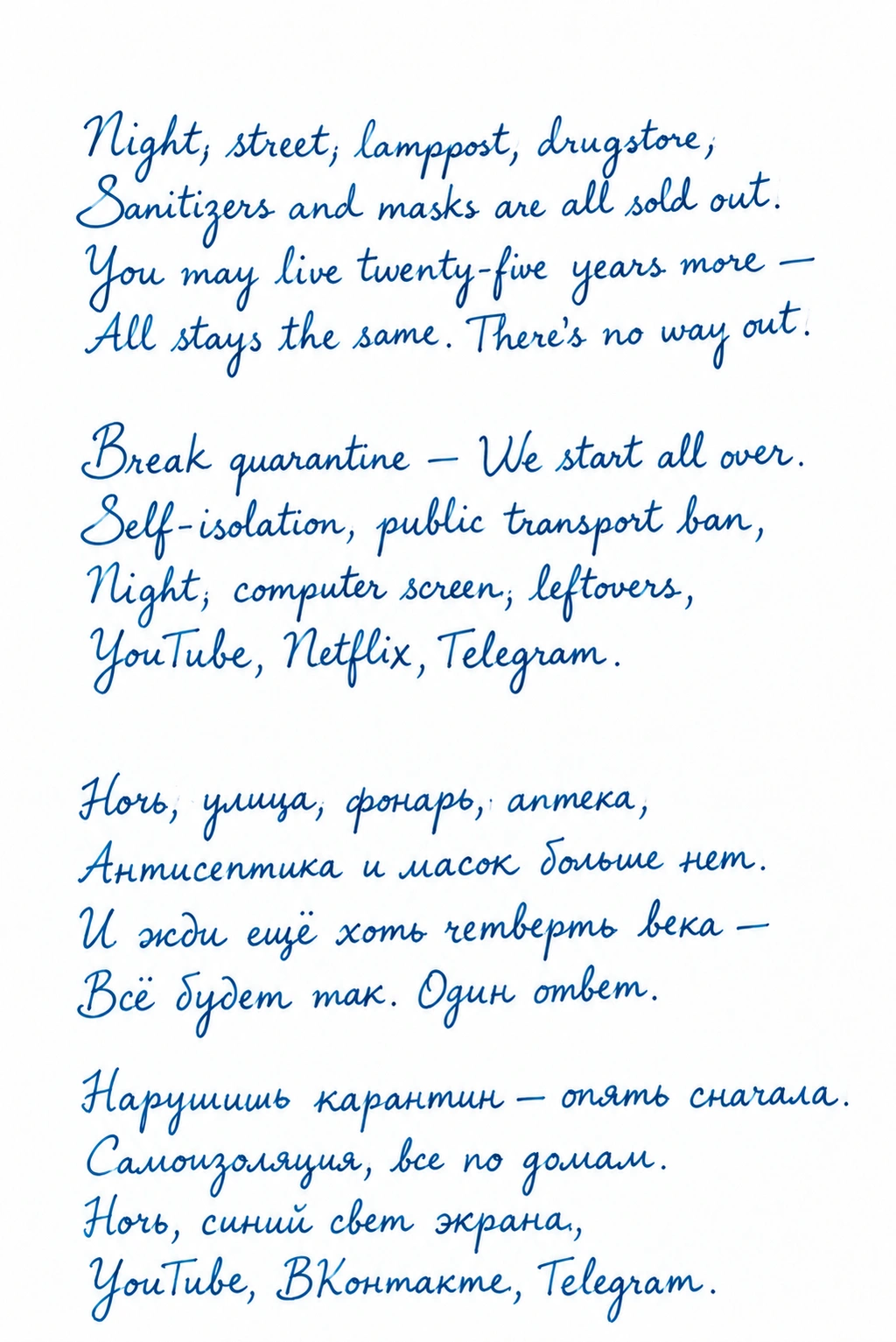
Night, street, lamppost, drugstore,
Sanitizers and masks are all sold out.

2020 · after Blok

Quarantine

Night, street, lamppost, drugstore,
Sanitizers and masks are all sold out.
You may live twenty-five years more —
All stays the same. There’s no way out.

Break quarantine — We start all over.
Self-isolation, public transport ban,
Night, computer screen, leftovers,
YouTube, Netflix, Telegram.

Ночь, улица, фонарь, аптека,
Антисептика и масок больше нет.
И жди ещё хоть четверть века —
Всё будет так. Один ответ.

Нарушишь карантин — опять сначала.
Самоизоляция, все по домам.
Ночь, синий свет экрана,
YouTube, ВКонтакте, Telegram.

2019

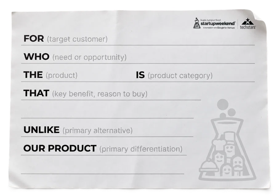
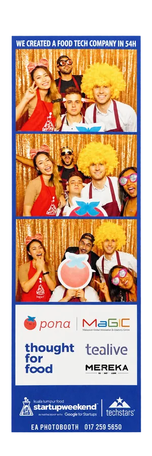
The original Startup Weekend Food positioning worksheet, printed on a sheet of paperOur Startup Weekend Food photo booth stripStartup Weekend FoodMalaysia’s first. 100 people, 54 hours.Pick up to explore. Drag with a mouse or use left and right arrow keys. Press Enter toread.
The original Startup Weekend Food positioning worksheet, printed on a sheet of paper

Startup Weekend Food

Malaysia’s first. 100 people, 54 hours.

A purple Thought For Food lanyard with the official logoThought For FoodBuilding food-tech partnerships across ASEAN.Pick up to explore. Drag with a mouse or use left and right arrow keys. Press Enter toread.
A purple Thought For Food lanyard with the official logo

Thought For Food

Building food-tech partnerships across ASEAN.

Bloodcount’s faceted red drop as an enamel pinBloodcountA health app I built and sold in a year.Pick up to explore. Drag with a mouse or use left and right arrow keys. Press Enter toenlarge the artwork.
Bloodcount’s faceted red drop as an enamel pin

Bloodcount

A health app I built and sold in a year.

Original Bloodcount website design explaining result tracking and lab report imports

Bloodcount

A health app I built and sold in a year. The original website introducing it.

Amber film holding scenes from Home Cooks of the WorldHome Cooks of the WorldFive films. Produced and directed by me.Pick up to explore. Drag with a mouse or use left and right arrow keys. Press Enter toread.
Amber film holding scenes from Home Cooks of the World

Home Cooks of the World

Five films. Produced and directed by me.

A red My Signature Dish cassetteMy Signature DishI produced fourteen conversations about food.Pick up to explore. Drag with a mouse or use left and right arrow keys. Press Enter toread.
A red My Signature Dish cassette

My Signature Dish

I produced fourteen conversations about food.

Pona’s smiling tomato logo as a glossy enamel pinPonaCo-founder & CEO. A marketplace for home cooks.Pick up to explore. Drag with a mouse or use left and right arrow keys. Press Enter toenlarge the artwork.
Pona’s smiling tomato logo as a glossy enamel pin

Pona

Co-founder & CEO. A marketplace for home cooks.

Original Pona home cooking presentation, slide 1

Pona

Co-founder & CEO. A marketplace for home cooks.

Startup Weekend Food positioning worksheetOur Startup Weekend Food photo booth strip

Malaysia’s first Startup Weekend Food. 100 participants, 54 hours.

A small flat SDG pin with seventeen coloured enamel segmentsUNDP Youth Co:LabMentoring founders and judging development projects.Pick up to explore. Drag with a mouse or use left and right arrow keys. Press Enter toenlarge the artwork.
A small flat SDG pin with seventeen coloured enamel segments

UNDP Youth Co:Lab

Mentoring founders and judging development projects.

Original certificate of appreciation presented to Philip Seifi for supporting the fifth Asia Pacific Youth Exchange, held January 7–19, 2019 in Bangkok, Thailand.

UNDP Youth Co:Lab

Mentoring founders and judging development projects.

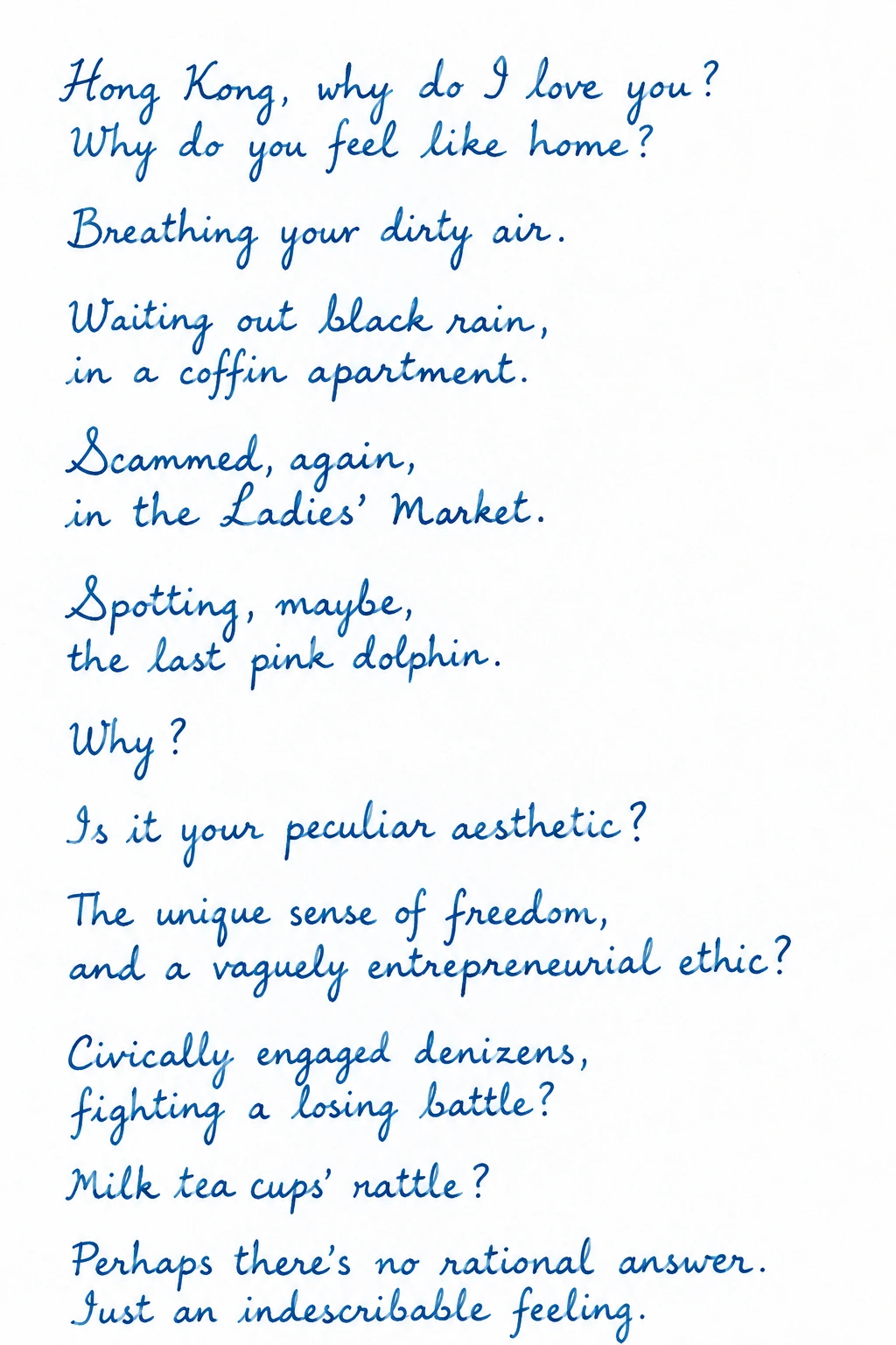
Hong Kong, why do I love you?
Why do you feel like home?

2019

Hong Kong

Hong Kong, why do I love you?
Why do you feel like home?

Breathing your dirty air.

Waiting out black rain,
in a coffin apartment.

Scammed, again,
in the Ladies’ Market.

Spotting, maybe,
the last pink dolphin.

Why?

Is it your peculiar aesthetic?

The unique sense of freedom,
and a vaguely entrepreneurial ethic?

Civically engaged denizens,
fighting a losing battle?

Milk tea cups’ rattle?

Perhaps there’s no rational answer.
Just an indescribable feeling.

My collage of Machhapuchare, with black paper peaks and copper cloudsMachhapucharePaper, copper, a mountain in Nepal.Pick up to explore. Drag with a mouse or use left and right arrow keys. Press Enter toenlarge the artwork.
My collage of Machhapuchare, with black paper peaks and copper clouds

Machhapuchare

Paper, copper, a mountain in Nepal.

The complete paper and copper mountain collage

Machhapuchare

A paper-and-copper collage of Nepal’s 6,993-metre Fishtail mountain, inspired by my hike there.

A journal-shaped object with the Wiley logo and British Journal of Educational Technology titleReviewing education researchWiley · British Journal of Educational Technology · 2019–20.Pick up to explore. Drag with a mouse or use left and right arrow keys. Press Enter toread.
A journal-shaped object with the Wiley logo and British Journal of Educational Technology title

Reviewing education research

Wiley · British Journal of Educational Technology · 2019–20.

British Antarctic Survey identity rendered as a field patchBritish Antarctic SurveyJudging sustainability ventures · 2019.Pick up to explore. Drag with a mouse or use left and right arrow keys. Press Enter toread.
British Antarctic Survey identity rendered as a field patch

British Antarctic Survey

Judging sustainability ventures · 2019.

2018

Minerva University logo on a textured paper stickerMinervaMentoring a semester-long food-waste project.Pick up to explore. Drag with a mouse or use left and right arrow keys. Press Enter toread.
Minerva University logo on a textured paper sticker

Minerva

Mentoring a semester-long food-waste project.

Sold LinguaLift.

Sold LinguaLift after growing the business to $250,000 ARR without outside investment.

A red Pona bread-bag clipPona, surplus foodSelected for The Refiners’ San Francisco accelerator.Pick up to explore. Drag with a mouse or use left and right arrow keys. Press Enter toenlarge the artwork.
A red Pona bread-bag clip

Pona, surplus food

Selected for The Refiners’ San Francisco accelerator.

Original Pona food waste presentation, slide 1

Pona, surplus food

Selected for The Refiners’ San Francisco accelerator.

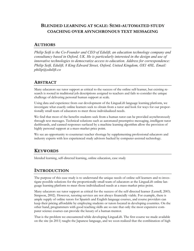
The original first page of my blended-learning manuscriptBlended learning at scaleResearch on tutoring at scale, informed by LinguaLift.Pick up to explore. Drag with a mouse or use left and right arrow keys. Press Enter toenlarge the artwork.
The original first page of my blended-learning manuscript

Blended learning at scale

Research on tutoring at scale, informed by LinguaLift.

Blended learning at scale, page 1 of 15
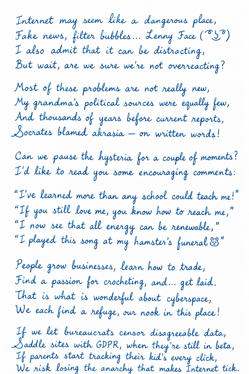
Internet may seem
like a dangerous place,

2018

Internet

Internet may seem like a dangerous place,
Fake news, filter bubbles… Lenny Face ( ͡° ͜ʖ ͡°)
I also admit that it can be distracting,
But wait, are we sure we’re not overreacting?

Most of these problems are not really new,
My grandma’s political sources were equally few,
And thousands of years before current reports,
Socrates blamed akrasia — on written words!

Can we pause the hysteria for a couple of moments?
I’d like to read you some encouraging comments:

“I’ve learned more than any school could teach me!”
“If you still love me, you know how to reach me,”
“I now see that all energy can be renewable,”
“I played this song at my hamster’s funeral🐹”

People grow businesses, learn how to trade,
Find a passion for crocheting, and… get laid.
That is what is wonderful about cyberspace,
We each find a refuge, our nook in this place!

If we let bureaucrats censor disagreeable data,
Saddle sites with GDPR, when they’re still in beta,
If parents start tracking their kid’s every click,
We risk losing the anarchy that makes Internet tick.

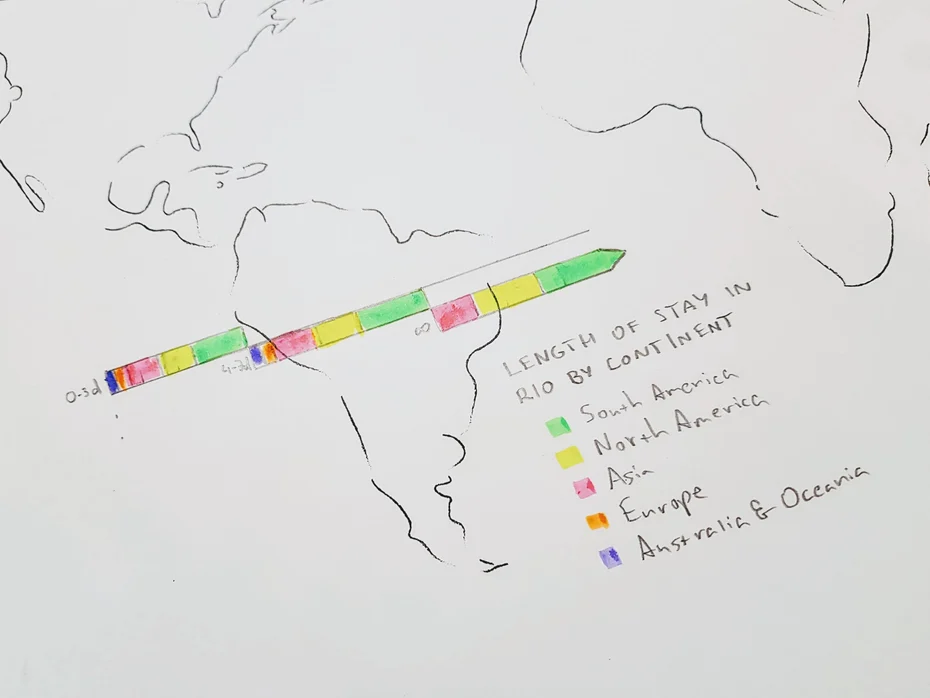
My pencil map of Rio, with a coloured chart of length of stay by continentTime in RioThought For Food · Rio, July 2018.Pick up to explore. Drag with a mouse or use left and right arrow keys. Press Enter toenlarge the artwork.
My pencil map of Rio, with a coloured chart of length of stay by continent

Time in Rio

Thought For Food · Rio, July 2018.

My complete Rio drawing and colour legend

Time in Rio

Thought For Food · Rio, July 2018.

2017

A perforated tomato-discount coupon with Pona’s pink mascotPona, nutrition coachingThe concept Pona began with.Pick up to explore. Drag with a mouse or use left and right arrow keys. Press Enter toenlarge the artwork.
A perforated tomato-discount coupon with Pona’s pink mascot

Pona, nutrition coaching

The concept Pona began with.

Original December 2017 Pona nutrition deck, page 1

Pona, nutrition coaching

The concept Pona began with.

Scrap.ai’s hand-drawn chip-and-weave logo with a frayed red-and-black fabric scrapScrap.aiIstanbul winner and global runner-up, Startup Weekend AI 2017.Pick up to explore. Drag with a mouse or use left and right arrow keys. Press Enter toread.
Scrap.ai’s hand-drawn chip-and-weave logo with a frayed red-and-black fabric scrap

Scrap.ai

Istanbul winner and global runner-up, Startup Weekend AI 2017.

Original hand-drawn Scrap.ai pitch deck, slide 1 of 11

Scrap.ai

Istanbul winner and global runner-up, Startup Weekend AI 2017.

Leaf’s geometric leaf emblem in turquoise and yellow glassOxford Learner’s Wordfinder Dictionary with its original cover and Oxford University Press spineLeafEducational software with Oxford University Press.Pick up to explore. Drag with a mouse or use left and right arrow keys. Press Enter toenlarge the artwork.
Leaf’s geometric leaf emblem in turquoise and yellow glass

Leaf

Educational software with Oxford University Press.

Leaf CMS, page 1
Leaf CMS, page 2
The Harvard Alumni for Global Development globe embroidered in crimson on a cloth patchHarvard Alumni for Global DevelopmentVice President of Networks, 2017–19.Pick up to explore. Drag with a mouse or use left and right arrow keys. Press Enter toread.
The Harvard Alumni for Global Development globe embroidered in crimson on a cloth patch

Harvard Alumni for Global Development

Vice President of Networks, 2017–19.

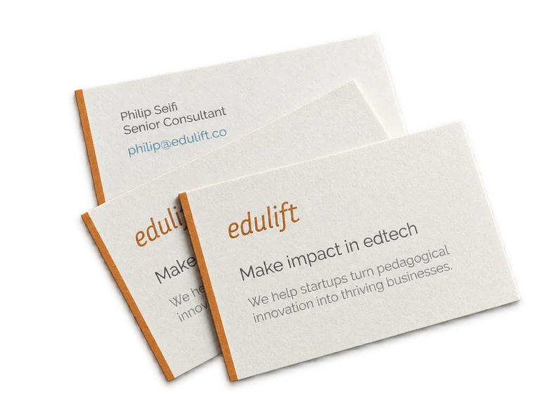
EduLift’s orange-edged cotton business cardsEduLift ConsultingProduct and strategy for education businesses.Pick up to explore. Drag with a mouse or use left and right arrow keys. Press Enter toenlarge the artwork.
EduLift’s orange-edged cotton business cards

EduLift Consulting

Product and strategy for education businesses.

Original EduLift Consulting deck, page 1
A black woven wristband bearing the Techstars wordmark and green underscoreTechstarsOrganising and mentoring Startup Weekends worldwide.Pick up to explore. Drag with a mouse or use left and right arrow keys. Press Enter toread.
A black woven wristband bearing the Techstars wordmark and green underscore

Techstars

Organising and mentoring Startup Weekends worldwide.

2015

The original dancing Fluent Panda messenger sticker, wearing yellow sunglassesFluent Panda£25,011 crowdfunded from 472 backers.Pick up to explore. Drag with a mouse or use left and right arrow keys. Press Enter toread.
The original dancing Fluent Panda messenger sticker, wearing yellow sunglasses

Fluent Panda

£25,011 crowdfunded from 472 backers.

The crimson leafy Veritas mark from my Harvard diplomaGraduating from HarvardCum laude. Organised a ball for 2,100 people.Pick up to explore. Drag with a mouse or use left and right arrow keys. Press Enter toread.
The crimson leafy Veritas mark from my Harvard diploma

Graduating from Harvard

Cum laude. Organised a ball for 2,100 people.

A print of drummers at the Vancouver May Day demonstrationMay Day, VancouverA documentary for a Harvard course · 2015.Pick up to explore. Drag with a mouse or use left and right arrow keys. Press Enter toread.
A print of drummers at the Vancouver May Day demonstration

May Day, Vancouver

A documentary for a Harvard course · 2015.

2014

The JoMI mark on a miniature black video cassetteJournal of Medical InsightBuilding a video journal for surgical education.Pick up to explore. Drag with a mouse or use left and right arrow keys. Press Enter toread.
The JoMI mark on a miniature black video cassette

Journal of Medical Insight

Building a video journal for surgical education.

Observing a blurry selfieobserving a blurry selfie curious bullfinch reflection in icy water

2014

Observing a blurry selfie

Philip Seifi & Samaneh Ka · 18–20 December 2014

observing a blurry selfie curious bullfinch reflection in icy water — PS

disturbing the calm pond sprinkling of soft rain — SK

first marks of wisdom voice so mellow birthdays come and go — PS

the whispering wind a tombstone for eternity — SK

white saucer, silhouette sitting on the granite cenotaph as gracious as ever — PS

angels with broken wings on the steps like fallen leaves — SK

shivering trees up above a scary howl warmth that turns on you — SK

caressing autumn wind rekindles last embers of my summer love — PS

kisses so soft like sun-kissed daisies a suffocating mania — SK

gone with the wind back to reality — PS

darkness stretching forever shattering silence fate haunted by probability — SK

like a cup in sadō spins the gifted ring… — PS

warm summer breeze memories hundreds of yards away wavy moon upon a pool — SK

we did not know our fate dandelion seeds will follow — PS

hushed soothing tones laughter around the corner twirling about carefree — SK

there was a time I could recognize the footsteps — PS

budding flowers on trees a smell so sweet biting cold gone for good — SK

reeds swaying side to side a first spring breeze — PS

all but gone cold feeling in my heart was it ever there? — PS

skipping beats time to time dreams morphing into nightmares — SK

perfect flashbacks get my soul back on-key the song of my life — PS

2013

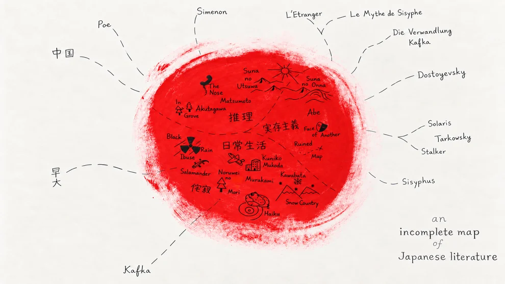
My hand-drawn map of Japanese literature on a red painted circleA map of Japanese literatureJapanese literature, mapped and illustrated by hand.Pick up to explore. Drag with a mouse or use left and right arrow keys. Press Enter toenlarge the artwork.
My hand-drawn map of Japanese literature on a red painted circle

A map of Japanese literature

Japanese literature, mapped and illustrated by hand.

Japanese literature map with corrected labels

A map of Japanese literature

Japanese literature, mapped and illustrated by hand.

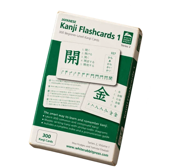
A physical rendering of White Rabbit Press’s green kanji flashcard boxWhite Rabbit Express postage stamp and Tokyo postmarkWhite Rabbit JapanProduct strategy for Japanese ecommerce and publishing.Pick up to explore. Drag with a mouse or use left and right arrow keys. Press Enter toenlarge the artwork.
A physical rendering of White Rabbit Press’s green kanji flashcard box

White Rabbit Japan

Product strategy for Japanese ecommerce and publishing.

White Rabbit Japan, page 1

2012

Softly coloured word blocks and lotus flowers from LinguaLift BlocksLinguaLift BlocksSerious Games Showcase finalist, 2012.Pick up to explore. Drag with a mouse or use left and right arrow keys. Press Enter toread.
Softly coloured word blocks and lotus flowers from LinguaLift Blocks

LinguaLift Blocks

Serious Games Showcase finalist, 2012.

An orange ship from Frenzy interpreted as a small metal toyLinguaLift FrenzyType before they reach you.Pick up to explore. Drag with a mouse or use left and right arrow keys. Press Enter toread.
An orange ship from Frenzy interpreted as a small metal toy

LinguaLift Frenzy

Type before they reach you.

2011

Traffic’s miniature crash: an overturned toy car and doll tangled in orange stringTrafficA little surrealism. 17 seconds. 2011.Pick up to explore. Drag with a mouse or use left and right arrow keys. Press Enter toread.
Traffic’s miniature crash: an overturned toy car and doll tangled in orange string

Traffic

A little surrealism. 17 seconds. 2011.

Hikari holding her purple books, from the original LinguaLift illustrationsLinguaLift200,000+ students, publishers and schools.Pick up to explore. Drag with a mouse or use left and right arrow keys. Press Enter toenlarge the artwork.
Hikari holding her purple books, from the original LinguaLift illustrations

LinguaLift

200,000+ students, publishers and schools.

LinguaLift, page 1

2010

My original vector bullfinch illustration with snowflakesA bullfinch in the snowAn early winter illustration.Pick up to explore. Drag with a mouse or use left and right arrow keys. Press Enter toenlarge the artwork.
My original vector bullfinch illustration with snowflakes

A bullfinch in the snow

An early winter illustration.

Original vector bullfinch with snowflakes

A bullfinch in the snow

An early winter illustration.

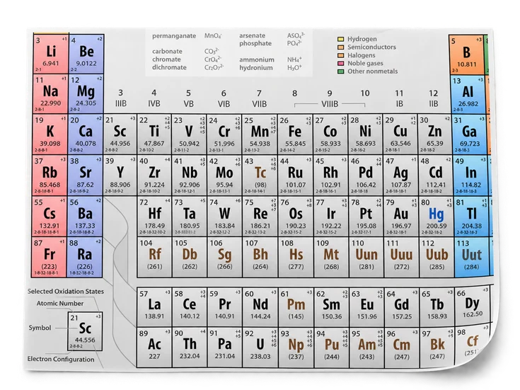
A paper detail of my periodic table designPeriodic PressA two-sided reference I designed for learning chemistry.Pick up to explore. Drag with a mouse or use left and right arrow keys. Press Enter toenlarge the artwork.
A paper detail of my periodic table design

Periodic Press

A two-sided reference I designed for learning chemistry.

The original periodic table

Periodic Press

A two-sided reference I designed for learning chemistry.

Electron structures on the reverse

Periodic Press

A two-sided reference I designed for learning chemistry.

Original Adobe Certified Expert certificate in Flash CS4, awarded to Philipp Seyfi on 1 April 2010Adobe Certified ExpertFlash CS4 · 1 April 2010.Pick up to explore. Drag with a mouse or use left and right arrow keys. Press Enter toenlarge the artwork.
Original Adobe Certified Expert certificate in Flash CS4, awarded to Philipp Seyfi on 1 April 2010

Adobe Certified Expert

Flash CS4 · 1 April 2010.

Original Adobe Flash CS4 certificate

Adobe Certified Expert

Flash CS4 · 1 April 2010.

An email from Max.

Max Hodges at White Rabbit wanted to buy NihongoUp and adapt it to his Japanese flashcards. We kept talking. Years later, we worked together.

2009

The actual NihongoUp award design: two engraved glass panels on a black glass baseNihongoUp wins Best Serious GameBest Serious Game, Student Category. 2009.Pick up to explore. Drag with a mouse or use left and right arrow keys. Press Enter toread.
The actual NihongoUp award design: two engraved glass panels on a black glass base

NihongoUp wins Best Serious Game

Best Serious Game, Student Category. 2009.

The original lilac NihongoUp balloon design as a cloth object, carrying a paper kana ticketNihongoUpBuilt in high school. Used by 50,000+ students.Pick up to explore. Drag with a mouse or use left and right arrow keys. Press Enter toread.
The original lilac NihongoUp balloon design as a cloth object, carrying a paper kana ticket

NihongoUp

Built in high school. Used by 50,000+ students.

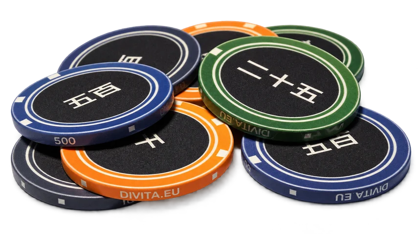
My original ceramic poker chips bearing Japanese numeralsJapanese ceramic chipsJapanese numerals, at the poker table. 2009.Pick up to explore. Drag with a mouse or use left and right arrow keys. Press Enter toread.
My original ceramic poker chips bearing Japanese numerals

Japanese ceramic chips

Japanese numerals, at the poker table. 2009.

White enamel United Nations emblem pinModel United NationsVienna · August 2009.Pick up to explore. Drag with a mouse or use left and right arrow keys. Press Enter toread.
White enamel United Nations emblem pin

Model United Nations

Vienna · August 2009.

The SPIN report booklet and the project’s two-wheel gearbox assemblySPIN!An autonomous robot, plus research with 532 people.Pick up to explore. Drag with a mouse or use left and right arrow keys. Press Enter toread.
The SPIN report booklet and the project’s two-wheel gearbox assembly

SPIN!

An autonomous robot, plus research with 532 people.

2008

Flashgarden wordmark recreated from its original 2008 banner, in the original lime-to-green coloursFlashgardenI built a marketplace for Flash developers.Pick up to explore. Drag with a mouse or use left and right arrow keys. Press Enter toread.
Flashgarden wordmark recreated from its original 2008 banner, in the original lime-to-green colours

Flashgarden

I built a marketplace for Flash developers.

The OSCE emblem as a small blue enamel pinModel OSCEVienna · July 2008.Pick up to explore. Drag with a mouse or use left and right arrow keys. Press Enter toread.
The OSCE emblem as a small blue enamel pin

Model OSCE

Vienna · July 2008.

2007

Making things for a living.Flash games, widgets, and my first clients.Pick up to explore. Drag with a mouse or use left and right arrow keys. Press Enter toread.
My original pink-gradient divita business card

Making things for a living.

Flash games, widgets, and my first clients.

First grade

A small, sharply sour wrapped sweetUnsere ZeitungWe wrote. We drew.
We printed it ourselves.
A magazine, every month.
Our monthly magazine.My first publishing venture, in first grade.
Pick up to explore. Drag with a mouse or use left and right arrow keys. Press Enter toread.
A small, sharply sour wrapped sweet

Our monthly magazine.

My first publishing venture, in first grade.

Reflection on a childhood of travel, and being raised in cultures distant to my own

One black bird flying against a flock of white birds

I made friends in Italian, Czech and Danish kindergartens before I spoke their languages. Then came a German primary school and a French middle school.

Each move was a new beginning: another way to learn, make friends and become myself.

Read more

Product-market fit pipeline: Make the most of your PMF surveys with Python

It can be disconcerting to blindly wait for a feeling you haven’t experienced before. To give us some guidance, the father of growth hacking Sean Ellis proposed a way to measure your product market fit using a simple survey:

Just ask a user, “how would you feel if you could no longer use the product?”

Based on Sean’s experience running growth at Dropbox, LogMeIn, and Eventbrite, and comparing results at other companies, achieving product-market fit requires at least 40% of users saying they would be very disappointed without your product.

Sean’s thesis eventually evolved into a time-tested PMF Survey (formerly survey.io) that not only evaluates product-market fit, but also identifies how to improve it.

Even if you are skeptical about the 40% threshold, or confident that you have a product-market fit already, sending out regular PMF surveys and tracking results over time will be invaluable to prioritize your roadmap and evidence your company’s progress to stakeholders.

A lot has been written about the methodology, and how it is used at companies such as Buffer, and Superhuman.

I’ll assume you’re already convinced you’d like to know your PMF. In this post I’ll show you how to distribute, analyze, and act on your PMF Survey.

I will show you how to:

  1. distribute your survey with Intercom and Typeform,
  2. ingest and label responses in Airtable,
  3. enrich them with demographic and usage data,
  4. segment and visualize them with Python and Plotly,
  5. and finally channel them to other services using Segment.

Prepare the PMF survey

Although Sean Ellis has his own official website that you can use to send out the survey, I recommend you use Typeform instead.

First, Typeform lets you customize the prompts as you learn more about your users. For example, if you’re targeting teens with your product, you may want to replace LinkedIn with Discord in the “How did you discover us?” question.

Second, Typeform offers official an integration with Airtable, which we’ll be using to label our data.

Creating a PMF Survey in Typeform

The questions

I will not go into the details of creating a Typeform survey, but below are the PMF Survey questions in a format that’s easy to copy over. When creating the prompts, make sure to mark them all as Required.

Typeform’s Airtable integration does not yet support the Other option in multi-choice questions, so you’ll have to implement a custom solution with Logic Jumps instead (indented in the list above):

Logic Jump in Typeform

You will also need to add a Hidden Field called user_id, which we will pass down from Intercom to connect responses to additional customer data (more on that below).

Hidden field in Typeform

Connecting to Airtable

I’ve prepared an Airtable template that you can easily copy and use for your own survey.

You can then follow official instructions to connect your Typeform to Airtable, and once you get to field mapping step, use the following setup:

Mapping fields between Typeform and Airtable

Send the survey through Intercom

It’s best to send out a PMF survey on a regular schedule, every 3-6 months.

It is unfortunately impossible to set up a schedule like this in Intercom, so you’ll have to trigger a new campaign manually every time. Alternatively, you could create a cron job on your own server that dispatches the survey through SendGrid, or your transactional email provider of choice.

You want to only get feedback from people who have recently experienced ‘real usage’ of the product.

Depending on your business, this could be customers who ordered a meal, made a sale, listened to at least one song, or created a new document in, say, the last 30 days.

The more recent the users, the better, but aim to survey enough customers that’ll give you at least 300 responses, to have have some flexibility in segmenting the data without giving up on statistical significance.

I won’t go into the details of creating a new Intercom campaign, but in my experience, it’s best to keep the message simple and casual, and make it clear the survey won’t take long to complete.

There is no need to offer any kind of reward — this could bias results.

Passing the user ID to Typeform using hidden fields

When you link to your survey, make sure to append #user_id={{ user_id }} at the end of the URL.

This will pass the user ID from Intercom down to Typeform, and allow us to enrich our survey results with customer data from other sources.

Label customers in Airtable

Next, we’re going to add short and consistent tags based on the long-form answers in each.

This step is laborious, but indispensable to make the most out of your survey results.

I’ve seen one too many teams send out a PMF survey, check they’re above the magical 40%, take but a quick glance at full-text responses, and forget it. The only thing that benefits from this exercise is their ego.

Just as the true power of the Net Promoter Score (NPS) lies not in a single number, but trends and follow-ups to respondents, the PMF survey is worthless unless you segment, dig deep, and continuously act on your findings.

It can be tempting to outsource labeling to a Mechanical Turk, but I would strongly recommend this is done by a core member of the team responsible for the product:

  1. Respondents often use imprecise language, abbreviations, and even metaphors. A good understanding of your business domain is therefore indispensable for this task.
  2. Carefully reading through every response will give you a visceral understanding of your customers, and their pain points, which will unconsciously guide your future decisions.

The first two fields you’ll have to process are Source: Other and Alternative: Other.

Simply go through the write-in responses and convert them into standardized labels in the Source and Alternative columns.

For example, this:

Becomes:

Tip: If you find the same Source keeps appearing in Other, consider adding it to the multi-choice in the survey.

Next, you will summarize long-form responses in the Benefit, Request, and Persona columns. People tend to mention several benefits and suggestions, and you will add a separate tag for each.

I would recommend you focus on Benefits mentioned by Very disappointed (high product-market fit) respondents, improvement requests by on-the-fence Somewhat disappointed respondents, and disregard the rest.

This will help you maintain your core customer value, pick the right features to work on next, and last but not least, save you time tagging hundreds of records.

Process responses in Python

Now we’ve labeled all our data, it’s finally time to do some data crunching and visualization.

Below, I will assume you have a working knowledge of Python, pandas and Jupyter notebooks.

If you can’t code, and have a dedicated data scientist on your team, you can let them take over from here.

If not, I highly recommend you don’t outsource this to your engineering team, and instead try to explore the data in Excel, Tableau, or another tool you’re more comfortable with.

Loading the data from Airtable

Instead of exporting a CSV and reading the file into Python, we can load the data directly with the Airtable API.

To get started, first install the Airtable Python wrapper (remove the ! if you’re running this in a terminal, rather than a Jupyter cell).

You can now import pandas, and the Airtable library:

Set your base ID, table name, and Airtable API key:

And fetch the data:

Enrichment with user traits from Intercom

PMF survey responses are most useful when segmented based on customer demographics and past purchasing habits.

Below, I assume that you have this data available as user attributes in your Intercom. You could of course import it from any other software, or directly from your SQL warehouse.

To get started, follow the official instructions to create a new Intercom app.

The Intercom Python library is unfortunately no longer maintained. To access your customer data, you’ll therefore need to downgrade your app’s API version from 2.0 to 1.4 (2019-09-26).

You can do this from the Configure > Basic information screen, after creating the app.

Next, install the library:

Initialize your Intercom client:

And finally enrich your responses with Intercom location data and attributes:

Exploratory data analysis with Plotly

The possibilities for segmenting and data exploration are practically endless, depending on your business, and the data you loaded up from your other sources.

Below, I’ll share but a few basic examples to get you started.

I’ll be using Plotly to visualize the data, but feel free to use seaborn or Altair instead.

Compare survey distributions to your overall customer base

There’s a good chance that your data is slightly biased.

For example, if you serve customers across demographics, you may get a disproportionate number of responses from teenagers on a holiday compared to busy professionals.

To keep this bias in mind when analyzing results, I like to plot the survey’s distributions, and compare them to those of all users.

Or, if you have population data at hand:

Plot product-market fit over time

You can use the rangeslider_visible setting to output an interactive plot which makes it easy to see how your PMF evolved over time:

Segment, segment, segment

Ever wondered how your product-market fit compares by country?

Or whether frequent customers are more likely to know of a substitute to your product?

The possibilities for exploration are endless, and highly specific to your business, and the demographic and usage data you have available.

All this data can become overwhelming. I therefore like to document all my findings, as I go, in a separate Notion document.

There, I include the questions I’ve asked, image exports of relevant data, and conclusions I drew for the business.

Updating user analytics with Segment

The final step is to upsert your new survey data to Intercom, and other services.

This way, you’ll be able to quickly message all customers that requested a particular feature once you release it, schedule a call with customers who agreed to answer follow-up questions, or create lookalike audiences to target your Facebook Ads.

You could push the data to Intercom using the library we used above. Here, I will show you how to do this with Segment, which will make the data available to all the different services you use to analyse and communicate with your customers.

First, install the Python library:

Import it and set your Segment write key:

Enable debugging messages:

And identify users one by one with your new survey data:

You could also track a Segment event in the same function, such as “PMF Survey Completed”.

To backdate your track and identify calls, you can add a timestamp argument to both functions, set to the Date column from your survey data.

What next

You’ve come a long way, and after doing all this analysis, you’re probably teeming with ideas for how you can improve your product.

How do you pick what to focus on first?

This questions is too big to answer here, but one approach is to spend half your time doubling down on what Very disappointed users have loved, and half — on requests by respondents who were on the fence.

To quote Superhuman, who use PMF Surveys to prioritise their roadmap:

Vision-driven teams are apt to double down on what users love. Feedback-driven teams are apt to double down on addressing feedback. But it turns out that neither extreme is optimal.

From there, the most important thing is to keep running the surveys at a regular schedule, and track how your product changes have affected results for different segments.

You should also try to set up calls with at least a couple of customers every week. You’d be surprised how much you can learn from even just a 15 min casual chat with one of your users. (If you want to get better at user interviews, this book is a must-read: The Mom Test: How to Talk to Customers and Learn If Your Business is a Good Idea when Everyone is Lying to You.)

Finally, if you’re part of a larger organization, be sure to share this data with your management, sales and marketing teams, who can use it to steer the company vision, or optimize ad campaigns.

Liked this post?

Follow me here on Medium and Twitter @seifip.

Read all the way here, but still need help?

Get in touch at philip@seifi.co to learn how I can help you achieve product-market fit through data analysis, and other product management consulting services.

Originally published on Medium.

AC remotes suck; let’s design one that doesn’t

AC remote redesign

When I teach design, my first two messages are:

  1. You don’t need to wait for anybody’s permission
  2. Opportunities for improvement are all around you

Today, I’m going to put my words into action, and show how a simple air con remote can be improved through the design method.

I hope you learn something from my process, and maybe even accept my challenge to repeat the same exercise with another device you’ve been frustrated by all your life!

Product vision

A good first step for a product design project is to define its vision — to think through your assumptions, user needs, the solution you have in mind, and its impact on the wider business (or nonprofit, community, and so on).

A good tool for this is the The Product Vision Board by Roman Pichler, which breaks things down into five simple steps: Vision, Target group, Needs, Product and Business goals.

Let’s apply this framework to our air con remote:

Vision

What is our purpose for creating the product? What positive change should it bring about?

An AC that is reliable and easy to use at night.

Target group

What market or market segment does the product address?

Business travellers sensitive to the temperature in their sleep, and staying in hotels equipped with mini-split AC units. (The reason I decided to target travellers rather than home users is that the latter have had the time to get used to their particular remote, alleviating common frustrations).

Needs

What problem does the product solve?

AC remotes are difficult to use in the dark, and when you’re half-asleep.

Product

What are we going to build and what will make it stand out?

AC remote with an intuitive layout that you can easily operate by touch.

Business goals

What business need does the product address? Why is it worthwhile for us to invest in it?

Business travellers are frustrated with AC remotes, which could affect overall satisfaction with the accommodation provided by our clients. Air cons are commoditized, and a better UX is an opportunity to differentiate within this crowded market.

Remember — your product vision should be a living document!

Start by listing your assumptions and intuitions, then adapt these over time, as you collect data from surveys, user interviews, and market research.

Market research

Most air conditioners come with cheap, infrared, monochrome remote controls — some slightly better designed than others. Surprisingly, even universal remotes rarely provide much of an improvement on the status quo.

The biggest issue is the utter lack of consistency. Even if you become accustomed to one unintuitive layout, this does not guarantee you’ll be able to operate a remote from a different air con, even of the same brand.

Notice how in the examples below, something as basic as the order of temperature control buttons is inconsistent. The One Key positions the buttons as ▼ ▲, whereas Chunghop places them in reverse order ▲ ▼.

Even remotes that were ‘designed,’ in the popular sense of the word, barely improve on the ergonomics, and sometimes make things worse by switching from tactile to capacitive controls.

Some modern air conditioners integrate with smart home mobile apps, and a number of hotels have experimented with their use, combined with the free rental of a pre-configured iPad or Android tablet available in the room.

A major downside of such app-based air con controls is they require you to look at a bright mobile display in the dark, disturbing your sleep.

There is also a risk that the mobile device runs out of battery if you forget to put it on charging.

Not to mention, AC remote users are usually not in a state to easily unlock a mobile device, find the right app, and navigate through its UI when they wake up in the middle of the night.

User interviews

I’ve conducted 10 user interviews with people who identify themselves as business travellers, and have used an air conditioner in the past (AC units are rare in some regions, such as parts of Europe or Russia).

These interviews were unstructured, but all revolved around the interviewees’ past experience with air conditioners, the particular features they have used in the past, and the frustrations they’ve experienced around their operation.

Below are select quotes from these interview sessions:

“I hate those things!”
“I only ever use the on/off button and warmer/colder buttons.”
“I just want to make the room cooler.”
“I feel too cold, feel too hot… try to find buttons to fix that.”
“I want to know how long it’ll take for the air con to reach my desired temperature.”
“I mostly use temperature control, fan speed and swing.”
“AC remotes are stupid. Never understood them.”
“Put it on auto, set ideal temperature and speed to 2, and be done with it.”
“I use Turbo mode when I come into a really warm room.”
“My biggest pain point is I can never find the damn controller.”
“It can be hard to figure out a new AC remote for the first time.”
“I don’t use timers but wish to learn to someday.”
“I’d prefer ACs to be controlled by a mobile app.”
“When the aim isn’t right you have to do the whole stupid “on/off/on/off” ritual with the confused system.”
“I don’t know what half the buttons do. I understand fan speed, but “dry” and “auto” vs. “cool”? I don’t get it!”
“I’d love a hard-off slider, so I’m not wasting remote battery in the winter.”

Most interviewees only use the AUTO operation mode on their aircon, combined with the target temperature control buttons.

Interestingly, interviewees consistently described their air con use as responding to a feeling of being too hot or too cold, rather than setting any particular temperature.

That is, they did not perceive the up and down buttons as controls that change the target temperature, but rather controls that make their surrounding warmer or cooler.

Finally, almost none of the respondents understood more advanced air con features, and although some expressed a desire to learn how to use them in the future, this was clearly more out of curiosity rather than any strong need.

A fascinating idea proposed by one of the interviewees was to flip the interaction from the user telling the air con their desired temperature, to the air con asking the user whether they feel hot, cold, dry, or comfortable. I will not explore this concept in this project, as it is better suited for smart home thermostats rather than generic air cons used in hotels.

If this were a real project by an established brand, a large-scale survey of existing customers would be a valuable follow-up to these one-on-one interviews. I unfortunately don’t have the resources to conduct one for this case study, nor could I find relevant research papers on the topic.

User persona spectrums

This project is an interesting case study for user persona spectrums, and how they can be more useful than individual named personas.

A persona spectrum is not a fake person. It’s an articulation of a specific human motivation and the ways it’s shared across multiple groups. It shows how that motivation can change depending on context.

To take one of the Microsoft Inclusive Design examples, a user can fall on the Blind end of a Vision spectrum for various reasons.

They may be permanently blind from birth, temporarily recovering from eye surgery, or situationally dealing with screen flare from the sun.

Source: Microsoft Inclusive Design

We can observe something similar with hotel guests operating AC controls.

Our users may be legally blind. But they may also be operating the remote in the dark, placing them in the same exact spot on the Vision spectrum.

Vision

Users operating the remote in the dark and the visually-impaired can’t see the screen and controls.

Blind ................................ Sighted

From here, we can identify two more relevant spectrums — dexterity, and familiarity with our remote. Here too, users may be slow to operate the device for various reasons. Some permanently, and some situationally, when using the device at night, and in a new environment.

Dexterity

Users operating the remote at night are slower to process information.

Slow ................................... Alert

Familiarity

First-time hotel guests are unfamiliar with the remote control.

Unfamiliar .......................... Familiar

Business travellers may also be more time-sensitive, and place more importance on quality sleep (such as before an important meeting), but these assumption would need more research to be validated or disconfirmed.

Mockups

Criteria

The basic criteria for our design are:

  • The remote must be easy to use by first-time users, in the dark, ideally by touch alone
  • The remote’s price and battery life should not be affected

Features

Based on our user interviews, the central features of a remote control are

  • Turn on/off the air con
  • Increase target temperature
  • Decrease target temperature

Most air con users don’t appear to ever touch other buttons, or even understand what they do.

Temperature controls
We are fortunate to deal with a rare case of an internationally universal pattern.

Across the world, high temperature is associated with the upward direction, and low temperature — downward.

It therefore makes logical sense to position the Temperature increase button at the top, and the Temperature decrease button below it.

Unfortunately, the lack of consistency between air con designs… ehm… conditioned users to mistrust such logical patterns.

To makes these buttons even easier to identify by touch, let’s change their shape to arrows ▼ ▲ — another universal human pattern, stemming from our hunter-gatherer roots.

To make these buttons even easier to find, without substantially increasing the cost of the remote, we could also make them phosphorescent (glow-in-the-dark).

Power button
Another type of controllers famous for their bad design are TV remotes. But, they are surprisingly consistent in one feature — the shape and placement of the power button.

The ON/OFF button is almost universally placed in the top-left corner, usually coloured in red, and tends to have a round shape, which also happens to match the IEC Power Symbol ⏻.

I can’t think of a more established pattern for the power button, and given that most people are at least familiar with TV remotes, it makes sense to adopt it for our air con project.

There is a case to be made for the separation of the ON and OFF buttons.

Due to the unreliability of infrared remote controls — an unfortunate limitation of the low-power constraint for this project — it often takes several presses to figure out whether the appliance is currently on or off, and get it to the desired state.

Such UI would be high unusual, however, with no equivalents in other common remotes. It would therefore require much more user research and usability testing, which I do not have the resources to conduct for this project.

Another ‘power user’ solution would be to interpret a long press of the power button as OFF at all times, but this too would be a highly unusual pattern, and would require custom programming of the receiving device.

Operation modes
Most air conditioners come with five modes of operation: AUTO, Cool, Dry, Fan, and Heat.

Many ACs also feature an additional Turbo mode, which operates at full capacity for 15–30 min before switching back to the previous setting.

It would be ideal to find out the frequency with which most people use individual modes. In the absence of such data, I will make some assumptions from our user interviews, personal experience using air cons, and observing others across different countries over the years.

First, most people always keep their air cons in AUTO mode. Both because it’s the default, and because it intuitively adapts to the target temperature selected by the user.

Heat and Cool modes can be useful for climates that consistently require both heating and cooling in the same day, but offer marginal benefit to most users. Other forms of heating also tend to be more efficient than using an air con for this purpose.

Dry mode is handy in humid climates, and can reduce your electricity bill under the right conditions. Most people are unlikely to resort to this mode on a regular basis, and particularly in a hotel setting, humidity is better regulated by a dedicated appliance.

Fan mode is equivalent to a ceiling fan, and given that, at least in most tropical countries, rooms come commonly pre-installed with both, its use is rarely a good idea.

Most traditional remotes feature a single button that rotates through all five modes. This not only slows you down, but also makes it impossible to switch to the correct mode without turning on the light to see the display.

Instead, I chose to separate each mode into individual buttons, starting with oversized AUTO and Cool (the two most common modes), followed by smaller Dry, Fan and Heat.

Both the ordering of operation modes and their icons are surprisingly consistent across different air con makes, so I chose not to change things too much on that front.

Fan speed
As a less commonly used feature, I positioned the fan speed selector below the two Operation mode rows, and directly under the Fan mode button.

Here too, most traditional controllers resort to a single button that rotates through HIGH, MED and LOW.

I used a second up & down rocker instead, which more closely matches the way people think about changing the fan speed.

This time, I did not use a triangular shape for the buttons, as users might mistake them for temperature controls while navigating by touch in the dark.

This also seemed like a good place to place Vertical and Horizontal swing buttons, which are intuitively associated with the fan operation.

Time settings
The last row is reserved for automating the air con based on the time of the day, and buttons allowing you to update the current time in the appliance.

This feature is both least commonly, and least frequently used, especially by business travellers — our target user group for this project.

Display

Ah, we forgot the last piece of the puzzle! Where do we pace the display?

Although we tried our best to make the remote operable by touch alone, the screen is indispensable for some functions (ex. setting the current time), and beneficial for many others.

To preserve our tactile, oversized power and temperature controls while keeping the size of the remote within reasonable limits, I went for an elongated, vertical LCD rather than the more common square.

This has minimal impact on component price, as elongated display panels are widely available for use in calculators.

On the display itself, the target temperature is shown at the very top, both because it is the most important piece of information, and so it doesn’t get covered by your thumb when tapping the ▲ and ▼ buttons.

This problem could also be solved by moving the display to the left side of the remote, but that would disrupt the intuitive positioning of the power button.

Following the target temperature, we’ll display the fan speed, current mode, and current time.

The full mockup

Below is the final mockup of the entire remote control, with some minor modifications. Familiar, yet much more intuitive and tactile than what you’d usually find in your hotel room.

I replaced the second oversized button with TURBO, which my initial user testing has shown is actually a beloved feature, at least among some air conditioner users.

Moving the Cool button below has also made for an intuitive row of basic modes of operation, and as an added bonus, made that whole section more pleasing to the eye.

In an actual physical product, it may be a good idea to emboss the four primary buttons — ON/OFF, ▲, ▼, AUTO and TURBO — with braille, which would make the remote more accessible for blind users.

There was a cool project submitted to iF by Donghua University, for an AC remote specifically adapted for blind users.

Unfortunately, the refreshable braille display would make such a remote very expensive, and unlikely to be adopted by the mass market.

It would also be desirable if the remote tapered off at the top.

This would make it not only more ergonomic, but also easier to orient correctly by touch alone.

It’s your turn!

Given that our priority is for this remote to be easy to use in the dark, by touch alone, user testing can only be done with a physical prototype.

It would be easy to make one using some paper, foam board, and a little glue — or even an Arduino board and a soldering iron… if only I could access any of these during the quarantine.

If any of you have the time to do some handicrafts over the weekend, I can’t wait to see your creations in the comments.

For everyone else, please take this as a challenge to apply the design process to another unintuitive tool or appliance in your surrounding, and share a link to your case study!

Liked this post? Follow me on 🐦Twitter @seifip

Originally published on UX Collective.

The Entrepreneurial Lifecycle and the role of government at each stage

A widespread misconception persists among both startup founders and the general public: government programmes promoting entrepreneurship are mere lip service, devoid of tangible impact.

Contrary to this belief, many individuals steering these programmes are genuinely committed to boosting their nation’s economic growth.

Why, then, so few make meaningful progress towards a vibrant and self-sustaining startup ecosystem?

As a serial entrepreneur who has travelled to over 120 countries, I’ve cultivated relationships with local businesses and government officials, gleaned insights from seasoned founders, and facilitated startup events globally, from San Francisco to Kathmandu.

What I found is:

The problem often lies not in bad intentions, lack of resources, or insufficient action, but in the lack of focus, and a misunderstanding of the entrepreneurial lifecycle.

Let me explain…

The pitfalls of the assembly line approach

Too many policy makers go directly to the what and how, and skip the why, when and who.

They begin by thinking ‘we need more startups’ and launch websites, bootcamps, university courses, and other programmes that try to take people in, and output businesses a set interval later.

This approach is ineffective at boosting entrepreneurship, which is not a skill, but a state dependent on external factors, and sheer serendipity — timing, team, unique insights, investment climate, and life situation.

There is a thousand and one reasons why participants don’t continue working on their projects after events such as the Startup Weekend, and most have nothing to do with the viability of the idea, the quality of the programme, or the team.

The reasons tend to be much more personal.

Some of the participants have cushy jobs that they are not ready to give up; others live paycheque to paycheque and can’t afford to take the plunge. Some are students about to pursue a challenging degree, and yet others are following a loved one to another country.

Moreover, in many cultures, a failed startup venture on one’s CV can be viewed as a significant setback to one’s professional reputation, potentially hindering future career prospects.

They have the right mindset, a good idea, maybe even the financial means to go ahead with their project. But, when the rubber hits the road, they realize they cannot give it their all — not right now.

Nurturing entrepreneurs with tailored support

To foster entrepreneurship more effectively, we should adopt an approach akin to lifecycle marketing, tailoring support to each stage of an entrepreneur’s journey.

This strategy acknowledges that entrepreneurs are not made. They can only be nurtured, on their own terms and schedule.

All we can do is promote positive serendipity, and make sure that when all the stars align, aspiring entrepreneurs don’t falter due to skill gaps, insurmountable bureaucratic hurdles, or lacking infrastructure (such as payment gateways).

Just as in lifecycle marketing, we must target people with different messaging and products over time, satisfy their pressing needs, and influence their behaviour at each stage.

The journey begins by raising awareness. We must introduce entrepreneurship as a viable path to those unfamiliar with it, instill confidence that they can do it, and help them develop foundational skills to increase their chances of success when they eventually launch a venture.

As individuals progress, our focus should shift to optimising external factors. This includes networking opportunities, financial support, counselling, mentoring, and so on.

It’s crucial to remember that we can’t expect individuals to take risks if they lack a basic comfort zone. Therefore, holistic support is essential, addressing both professional and personal needs.

The 4 stages of the Entrepreneurial Lifecycle

💡 I. Inspire future entrepreneurs

The early stages of the entrepreneurial lifecycle present the greatest opportunity for governmental impact. As ventures approach profitability, they naturally attract private sector attention, reducing the need for public intervention.

Programmes such as Startup Weekend, Asia Pacific Youth Exchange, and Youth:Co Lab offer immense value, with many participants achieving significant success two, five, or ten years down the line.

However, in order for such programmes to succeed, the number of companies started cannot be one of their KPIs.

The goal of early stage programmes is to create not companies, but entrepreneurs.

Their primary function is to move participants further in the lifecycle — teach them that entrepreneurship is a viable path, build confidence that they can do it too, and finally nurture their basic skills such as public speaking and design thinking.

Example: UNDP Youth:Co Lab
As an intergovernmental organization with limited budgetary or electoral pressures, the United Nations has more freedom to invest in the development of entrepreneurship in the earliest stages of the lifecycle. Programmes such as the UNDP Youth:Co Lab focus on 21st century skill education and promote entrepreneurship as an acceptable path across Asia. Many of the participants go on to found successful social enterprises after graduating from the programme.

The value of new connections and learnings can extend far into the future. As such, early stage initiatives should not just consider the value they provide during the programme, but use it as leverage to generate value indefinitely into the future.

Therefore, they should first and foremost encourage lasting connections among participants, facilitate ongoing mutual support, and nurture the development of lifelong friendships and potential business partnerships.

Example: Thought for Food
Thought for Food is a group of 5,000+ individuals from 105 countries working to answer a single question: How to sustainably feed 10 billion people? They do not live together, and only occupy the same space one week per year, but the sense of community TFF holds is one of the most powerful I’ve experienced. This is achieved through a common purpose, a shared folklore passed down to new members, and regional ambassadors who keep the conversation going long after the annual summit.

Upon completion, early stage programmes can and should provide optional continuous support, or feed participants to organizations operating in the later stages of the lifecycle. However, they should refrain from urging participants to immediately start a venture.

Great ideas die because entrepreneurs are pushed to execute too early — while they are not at the right stage of their lives, when they don’t have the right team around them, or when the market isn’t ready for their idea.

Example: Startup Weekend
Techstars, a global accelerator, has helped organize thousands of Startup Weekend events around the world. Although some of the projects that come out of the three-day frenzy of business model creation, coding, design, and market validation become successful businesses, there is no pressure for participants to stick to their projects. The goal is to nurture future entrepreneurs over a series of events, building up their network and entrepreneurial toolkit, so they are ready when the right opportunity presents itself.

🌱 II. Incubate new ventures

Democracies of the world are shaped by election cycles, which inevitably leads to short-term orientation. Many initiatives thus want businesses to be the output of their programmes.

This is unfortunate, but also understandable, as thriving startups are an easier sell to taxpayers than a cohort of inspired young adults.

If the objective of a programme is to output successful projects, rather than future founders, it must target individuals who are in the latter substages of the lifecycle — helping them align the missing stars, and overcome specific logistical challenges.

Example: The Refiners
The Refiners is a San Francisco-based accelerator which takes in serial entrepreneurs with a product and traction, and provide targeted mentorship on the specifics of doing business in California, legal support with immigration to the US, and so on.

Example: MaGIC National Regulatory Sandbox
The Regulatory Sandbox at the Malaysian Global Innovation & Creativity Centre targets startups that require legal changes to operate in the country. The programme provides a controlled environment for innovators to pilot their solutions, while working closely with the government on regulatory frameworks that can support their businesses.

The earlier the target participants are in the lifecycle, and the more stars there are to align, the longer the programme needs to be.

Example: Entrepreneur First
Entrepreneur First is an international accelerator that takes in talented individuals highly skilled in computer science, and with a diverse professional and personal background, but no team or clear business idea. The reason the programme works is it’s 6 months long, includes a very generous stipend, only accepts participants who are ready to give up everything to start a business now, and provides an abundance of support for years after the programme.

While the public sector’s involvement is most beneficial in the early stages, governments have unique opportunities to support startups throughout their lifecycle in ways that surpass private sector capabilities.

This is particularly true for deep tech startups with long R&D timelines, or companies that integrate with the public infrastructure. When done well, government contracts can make or break projects of this kind.

Example: Metropolitan Transportation Authority
The New York Subway has been in a state of emergency for more than a year, due to ageing infrastructure overwhelmed by ever increasing ridership. To solve these challenges, the MTA has launched the Transit Tech Lab accelerator, which gave six startups access to one of the most complex transit systems in the world, and streamlined procurement processes to accommodate small business.

🚀 III. Facilitate growth

Governments disengage too early.

As companies begin to turn a profit and expand, they’re frequently left to fend for themselves or are redirected to economic development departments ill-equipped to handle their unique needs.

While it’s true that ‘easy money’ through governmental grants and contracts must eventually taper off to avoid creating dependency, the cessation of all support once a company reaches the scaleup stage is a missed opportunity.

Innovation-driven enterprises, to borrow Bill Aulet’s term, are fundamentally different from traditional companies with no aspirations for rapid, global growth.

As such, the kind of support they need, from timely changes of outdated laws to infrastructural improvements, requires champions who have followed them over time, and understand their unique situation.

Example: AB-626 — California’s home cooking bill
When Josephine, the home-cooked food marketplace in Berkeley, grew to a few thousand sellers, local food safety officials decided it’s time to do something about it. With a heavy hand, they came knocking on home cooks’ doors, threatening them with up to three years in jail lest they cease their operations. Josephine unfortunately went bankrupt, but after working closely with the state government, their team managed to negotiate a mutually-acceptable solution. California is now home to several startups (including my own — Pona) creating new economic opportunities in the kitchen for stay-at-home parents, seniors, and disabled individuals.

Example: London Datastore
In 2010, the Greater London Authority launched
London Datastore, an unprecedented open-data initiative offering unrestricted access to reams of public sector data for private or commercial use, with the aim of kickstarting a new wave of services that find novel ways to make use of the information. This initiative, which includes a developer-friendly API, is behind numerous success stories, such as Citymapper.

More importantly, it is crucial to keep entrepreneurs at this stage as active participants in the ecosystem.

Among others, scaleups are invaluable to:

  • Serve as role models for younger startups
  • Provide exit opportunities for projects that can’t make it on their own
  • Build platforms and infrastructure that lowers the risk of starting new businesses

History is full of examples of pioneering firms that served as “entrepreneurship academies,” from which other entrepreneurs sprung.
— Josh Lerner, Boulevard of Broken Dreams: Why Public Efforts to Boost Entrepreneurship and Venture Capital Have Failed

🌀 IV. Capture know-how

Most companies will fail. Others will mature and grow beyond their wildest dreams. Whatever the case, eventually, their early employees and founders will exit, and maybe even start new ventures.

This pivotal stage in the entrepreneurial lifecycle distinguishes mature ecosystems like Silicon Valley from emerging counterparts worldwide. It’s here that the true value of experience — both successes and failures — becomes apparent.

For governmental startup initiatives to maximise their long-term impact, they must effectively close the loop, capturing and recycling the hard-won wisdom of entrepreneurs they’ve invested years and substantial resources in nurturing.

At its most basic, this means events that give serial founders the opportunity to share their successes and failures.

At its best, this includes incentives for angel investors, a safety net for failed founders to get back on their feet without selling-out to the corporate world, progressive IP law reforms, and a culture that values failure for the learnings it brings to the ecosystem.

Example: UK tax incentives for angel investors
Angel Investors in the UK have access to important tax relief schemes (EIS, SEIS & SITR) that recognize the risks they take in giving back to the ecosystem, and the unique value they provide compared to institutional investors (mentoring, industry know-how, personal connections…)

Example: Non-compete enforcement in California
California courts refuse to enforce contracts that limit employee mobility. This unusual approach to non-compete agreements promotes competition, and may be one of the reasons behind the West Coast’s rise as an international hotbed for innovation.

Example: Recycling of know-how in the Silicon Valley
Whereas in most countries, failed entrepreneurs have to resort to regular jobs, and often exit the ecosystem forever, Silicon Valley startups see them as worth their weight in gold. After all, what’s a better shortcut than hiring someone who has researched your niche for years, and learning from their failure? This is true even for big tech companies such as Google and Facebook, who are known to rehire former employees after their stint in the startup world.

Example: Singapore’s acceptance of failure
Singapore has long tried to make the nation more comfortable with the uncertainties inherent to entrepreneurship. One initiative, the Phoenix award, recognised founders who made a successful comeback after braving failure. Asia’s first Failcon, organized under the auspices of The National Research Foundation, then gave entrepreneurs a platform to share their learnings. Although empirical data is hard to come by, Singapore’s thriving startup ecosystem is an indication that the culture has changed for the better.

The power of focused initiatives

In the realm of entrepreneurship support, focus is not merely beneficial — it’s essential. Just as thriving businesses must have a clear understanding of their target market, successful incubators, accelerators, and other entrepreneurial initiatives must possess a precise vision of whom they aim to serve.

If we do not know who the customer is, we do not know what quality is.
— Eric Ries, The Lean Startup

When conceiving any programme within the startup ecosystem, it’s crucial to pinpoint the exact stage of the entrepreneurial lifecycle you intend to address. This decision will fundamentally shape what constitutes success for your initiative.

Are you aiming to inspire nascent entrepreneurs, planting seeds that may bear fruit years down the line? Or is your goal to empower existing entrepreneurs, providing them with the tools and resources to make an immediate impact?

Many programmes ambitiously attempt to cater to all stages simultaneously. However, this approach often leads to diluted efforts and suboptimal outcomes. The needs of a first-time founder differ vastly from those of a serial entrepreneur scaling their third venture. Each stage demands distinct resources, mentorship styles, and support structures.

By honing in on a specific stage of the entrepreneurial journey, you can tailor your programme’s content, mentorship, and resources to maximise impact. This focused approach allows for deeper, more meaningful interventions that resonate with participants long after they’ve completed your programme.

Moreover, a concentrated effort enables you to build expertise in addressing the unique challenges of your chosen stage. Over time, this specialisation can position your initiative as a go-to resource within the broader entrepreneurial ecosystem.

In the end, focus isn’t just about efficiency — it’s about effectiveness. It’s about creating a programme that truly understands and meets the needs of its participants, fostering entrepreneurial success in a meaningful and sustainable way.

Liked this post? Follow me on 𝕏 @seifip

Originally published on The Startup.

Reflection on a childhood of travel, and being raised in cultures distant to my own

Born in a country, which was on the verge of collapse a mere one year after my birth, I never found a place which I could call home.

But no, I do not mind this at all.

As the saying goes, “home is where the heart is,” and my socio-spatial independence has allowed me to find a niche in my heart for each and every bit of culture I have encountered during my travels.

Day and Night by M.C. Escher
Day and Night. M.C. Escher

Although a far cry from the nomads you hear about today, my parents always had a global outlook, even when the Iron Curtain hung intact. My mother through her studies of the Danish language, and my father, impassioned by foreign film.

After the dissolution of the Soviet Union, the path was finally clear to go abroad. Or at least to the visa sections of foreign consulates.

By the age of 12, I had traveled to ten countries, and lived long term in another three. I made friends in Italian, Czech and Danish kindergartens without speaking a single word in the languages of my peers, joined a German primary school, only to publish an illustrated newspaper with my Vietnamese classmate, and then attended a French middle school, only to self-study Japanese for my finals.

When people hear my story, the initial excitement is followed by an avalanche of concerns. “Poor boy, you probably never had any friends as a child!”, “How stressful it must have been to move from school to school!”

Truth is, my childhood was great. It was exciting, instructive, and inspirational. It prepared me for life in an ever more globalized world of today, and instilled independence which helped me bootstrap a successful edtech startup while living as a digital nomad.

I’d like to take this opportunity to answer some of the common questions I get about growing up in a mobile family.

Metamorphosis III by M.C. Escher
Metamorphosis III. M.C. Escher

How did you overcome the language barriers?

Spoken words are not the only way to communicate, and the sooner you learn that, the better you’ll be at fitting in in foreign cultures. Being in a foreign language environment in preschools wasn’t easy, but I learned to deal with it through assimilation, and imitation.

My parents like to joke about my time in the Italian kindergarten’s choir. I’d confidently walk on stage with everybody else, and open my mouth to the rhythm of the music, producing no sounds, and of course oblivious to the lyrics.

Later on I started to pick up some basic words and phrases to get me through a regular day, and learned to sense out what my peers and teachers wanted.

Quando si mangia non si parla. (When you eat, you don’t talk.)

Once I got to school, things became more intense, as I suddenly had to do homework in a foreign language. International schools are used to students like me, however, so there’s enough support to help you plow through the initial difficulties, and learning a language through immersion is weirdly exhilarating!

These days there are many organisations that enable students to go on study exchange programs. So, you don’t need to live in a nomadic family to get the benefits of mingling with native speakers of the language you want to learn.

Metamorphosis III by M.C. Escher
Metamorphosis III. M.C. Escher

Was it difficult to make friends with all the constant changes?

If anything, the experience taught me how to make friends faster, and be more open to people outside my social group.

Friendships rarely lasted, but this taught me to appreciate the present and all the good memories with people I might never see again. It also made me acutely aware of how my behaviour can change depending on the kind of people I socialize with.

There’s nothing inherently wrong with spending a few good years with one group of friends, then saying good bye and joining a new circle of friends somewhere else. It does not devalue the relationships you had, or threaten the memories you shared together.

Again, studying at an international school helped here. Most of my classmates would be in a similar position, moving every few years with their parents on expat packages and in foreign service. We all quickly learned to treat each move not as an unfortunate ending, but rather as a new beginning — an opportunity for change and self-discovery.

Metamorphosis II by M.C. Escher
Metamorphosis II. M.C. Escher

Would you wish to have experienced a more traditional childhood?

I sometimes wonder what it would have been like to grow up in a small community, go out for coffee with the same group of people all my life, speak one language, and enjoy the unexciting, but familiar status quo.

I have no regrets though, and deep in my heart, I feel like the world would be a better place if more people would come out of their cradles, grow a thicker skin, open up to outside views, and appreciate the boons of independence.

Metamorphosis I by M.C. Escher
Metamorphosis I. M.C. Escher

Is there a place you call home? What is your identity?

I believe everyone is better off staying clear of labels, and forging an identity of their own.

It forces you to be more self-aware, reason through everything you do from first principles instead of following the masses, and ultimately think outside the box — something we need now more than ever if we are to solve climate change, and other global quandaries.

I do feel a strong connection to some places and cultures, and feel less at home in others, but this connection does not always correlate with the amount of time I spent in the country, or with a particular person.

My Russian and Tatar heritage has had a strong impact on my thinking, but so has my life in East Asia and Europe, education in the US, and words of philosophers far and wide. I feel like a local in Moscow, but also in London, and Hong Kong.

Natives of all three cities might frown on my self-declared identity, and it goes against the etymology of the word. Maybe it’s time to start talking about selfhood instead?

Originally published on Medium.

Optimal Matching for Marketplace Startups and the Role of Bias

While matchmaking is a core lever of any marketplace business, data crunched by Uber, Airbnb, and other marketplaces shows that engineering an optimal marketplace sometimes defies common sense.

For example. You finish dinner and are ready to head home. You see plenty of Uber drivers, but you're matched with a car 10 minutes away. It makes no sense!

Greedy and Network-Optimized Matching

In our Uber example above, the intuitive approach is to match each rider with the closest car, on a first-come, first-served basis. However, while such transaction-level optimization leads to the shortest possible time for customers in high-trafficked areas, it can also lead to a terrible experience for other customers and suboptimal aggregate wait times.

A better long-term solution, that takes into account the needs of the entire user base, is to predict imminent demand, and optimize matchmaking for a network-level variable such as aggregate wait time. This is exactly what Uber does, in a feature called batched matching.

Let’s consider the example below:

Original marketplace matching diagram 1

The figure on the left illustrates greedy matching, the intuitive expectation of most riders that find themselves in our scenario. This approach leads to the minimal wait time of just one minute for rider A, but makes rider B wait six minutes, for an aggregate wait time of seven minutes.

The figure on the right illustrates network-optimized matching, which is closer to how most ride-hailing apps assign riders to their pool of drivers. This approach leads to a longer, but still reasonable wait time of three minutes for rider A, and a short wait time of just two minutes for rider B, for an aggregate wait time of five minutes, a 33% improvement over greedy matching.

And since 2017, if a better match becomes available after you book a ride, Uber will automatically swap your trip — a feature internally branded as Trip Swap. This may be a nuisance to drivers when it first happens to them, but over the lifetime of their driving will earn them more money.

Fungibility and its Impact on Matchmaking

In a fungible marketplace, supply is interchangeable. Ignoring premium options, one Uber driver is broadly equivalent to another. Similarly, most customers will care little whether their Instacart carrot delivery comes from Aldi or Costco.

In a non-fungible marketplace, each supplier provides unique value. Airbnb hosts offer a very different experience from one another. Similarly, on the home-cooked food marketplace I’m currently launching, Pona, where we have home chefs who provide specialist dishes that are not available from other sellers on the platform. In reality, fungibility is not black and white, and whether a supplier is interchangeable with another can depend hugely on market expectations. Many businesses operate between these two extremes (think tradespeople on TaskRabbit, or business formation lawyers on LegalZoom).

Recognizing where your marketplace startup falls on the fungibility spectrum is crucial. It has major implications on how you approach matching, pricing, and other core aspects of your marketplace business.

The Airbnb recommendation engine is a good illustration of how optimal matching changes with fungible supply.

Most – especially high-value – customers won’t browse through pages of listings if the initial results fail to inspire confidence in the platform. It is, therefore, a priority for Airbnb to optimize the first five to 10 listings in your search results.

The greedy approach to ordering Airbnb listings would be to show properties that will result in an immediate booking by the user. Under this scenario, all customers would see broadly similar results with an exceptional cost-benefit ratio, and book them on a first-come, first-served basis.

Of course, there’s a better solution. Just as with our Uber example, Airbnb should, and most probably does, optimize search results for network-level variables (Airbnb’s website only says that there are "more than 50 factors that contribute to each set of search results”).

Original marketplace matching diagram 2

In the example above, if a property rental website optimizes at a transaction level, the first customer to make a booking can end up with a better property than they expected. That’s all good and well, but it may mean that a more picky customer making a booking just minutes later is left with no acceptable options.

If the website optimizes at a network level, on the other hand, the search algorithm could nudge the first user to book a different property that's equally satisfactory for them and keep the exceptional option available for the picky customer who makes a booking about the same time.

Rather than “will the user make a booking?”, the Airbnb product team might ask something closer to “will showing these five properties lead to the highest aggregate number of bookings in this city?”. They might even optimize for aggregate Lifetime Value (LTV), taking into account that some customers are less price-sensitive than others.

The Impact of Bias

Why don’t companies such as Uber and Airbnb prioritize best-behaved, repeat customers in their matching? Wouldn’t it be a good idea for Uber to reward its best customers with faster service? Or for Airbnb to highlight Superhosts above all other results? Just as with greedy matching, bias in matchmaking can lead to suboptimal outcomes at a network level.

This is what we found out at Pona. Most of our cooks specialize in regional, international, and experimental cuisine that is not sold in restaurants, which makes our supply less fungible than for other delivery apps. For example, we only have one Ethiopian home cook in our service area, and she is also one of our top-rated and best-selling chefs. She can only cook a limited number of dishes per day, and always sells out.

On the demand side, the greedy, unbiased approach would be to display her profile to all customers, ordering search results either randomly, or based on distance. A better, network-optimized algorithm might nudge buyers to try food from a different chef each day, or take into account how picky each customer is about their food choices.

In either case, there is a strong temptation to introduce bias into the search results. For example, we could show our top chefs to high-value customers first, as a reward for their loyalty.

Bias can also creep in as a side-effect of a seemingly unrelated feature. For example, some of our customers have asked for a way to follow their favorite chefs, so they can see them at the top of their search results. But what seems like an obvious, and rather benign little feature has the potential to wreak havoc at the network level.

Original marketplace matching diagram 3

Just imagine if a dozen customers "favorite" our Ethiopian chef. If we had surplus demand, as in the illustration above, our Ethiopian chef and other top sellers would make all the sales. This would prompt new entrants to leave and in turn, reduce the variety of food available on the platform. If we had surplus demand, new Pona users would never get to see our Ethiopian chef, or taste her cuisine, and would be banished to new and less exceptional sellers.

An unbiased approach allows us to ensure sales are more evenly distributed across all our chefs. If you’ve ever wished that Airbnb allowed filtering based on user reviews, now you have a better idea as to why the feature is unlikely to be introduced any time soon.

Original marketplace matching diagram 4

To further complicate matters, Pona orders are made at least 24 hours in advance, and our sellers have no overhead costs such as rent or staff. Our chefs say they would prefer to cook one large batch of soup, sell it all on a single day, and enjoy their free time for the rest of the week, rather than sell one portion every day of the week (even if it meant fewer sales overall).

In a surplus supply scenario illustrated above, the ideal matching algorithm would cluster sales on a different day for each cook, which would be impossible if search results were biased by favorites, or a ratings-based ordering.

I know all this can be overwhelming, and as a startup with limited resources you can’t have a team of data scientists optimizing your every match. Fortunately, top academics and product teams at Uber, Airbnb and the like have done a lot of the work for you.

Although each marketplace is different, and you will want to run your own simulations and A/B tests down the line, it’s worth keeping the considerations above in mind as you build your product. Developing a matching algorithm? Think about whether distance is the best variable to base it on. Launching a new feature? Consider how it might inadvertently bias your search results. And as you grow, make sure to dedicate ample resources to these questions.

This article was in part inspired by a talk by Uber product manager Tanvi Surti

Originally published on Mind the Product.

Original divita business card front, with its white wordmark on a pink gradient
Original divita business card back, with its QR code and Philip Seyfi’s contact details
A wrapped sour sweet

First grade

Unsere Zeitung

I organised a team. We wrote articles, made drawings, and printed a magazine every month.

Then we sold it. Some of the money went on candy.

Eventually, we were shut down. It left me wary of authority.

Mentoring founders.

  • UNDP
  • Thought For Food
  • Minerva University
  • British Antarctic Survey
  • Techstars
  • Techstars · Startup Weekend organiser & mentor
  • UNDP Youth Co:Lab · Mentoring young entrepreneurs
  • Minerva · Civic partner for a semester-long food-waste project
  • Asia Pacific Youth Exchange · Mentor and judge in Bangkok
  • UNDP Springboard · Mentoring FoodHunter
  • British Antarctic Survey · Judging sustainability ventures in Kuala Lumpur

Need someone who can take a product from research through design and development? Talk to me.

Writing about the work.

In other people’s words.